And one more makes three
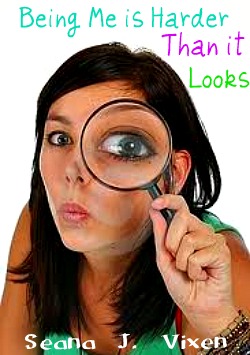 Howdy ya'll. I got a couple of responses to yesterday's BMHTL covers. Many of you said that cover A was the one that you preferred over cover B. I have to admit that that is the one that I liked better too. Her hair is flowing in a really cool way and I really liked the font. But my BFF/editor July has informed me that perhaps they're a little too serious for my book, which has it's comedy moments. So to make her happy, I've devised a more humorous one. I can't promise that this is the cover or not the cover, but it's another option. So on the left you can see Option C.
I can't say that I like this one as much as Option A, but it's just another idea. The only thing I don't like on this cover is that the girl doesn't look like my character Minnesota Albuquerque. Her hair is too dark of a brown and she's lacking the things that make Minnesota, well, Minnesota. Like her electric blue glasses for example. =D
Anyways, if you like this cover let me know. I think I'll put a poll on the side of my blog to see what people like the best so far of the covers that I have designed. Designer covers is actually really fun thanks to technology these days. Haha. I sounded really old in that sentence.
Bye for now,
~Seana


I like that one a little better but yeah I agree... it's not Min.
ReplyDelete